Joanie LeMercier: Bright Matter
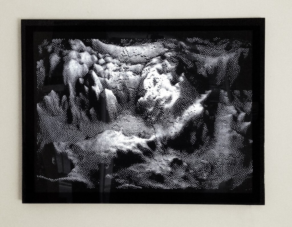
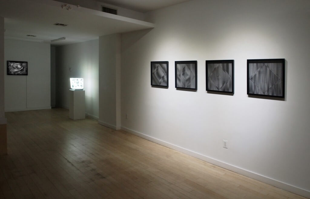
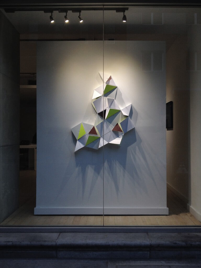
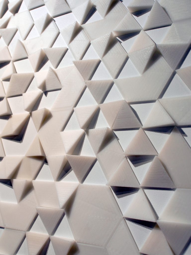
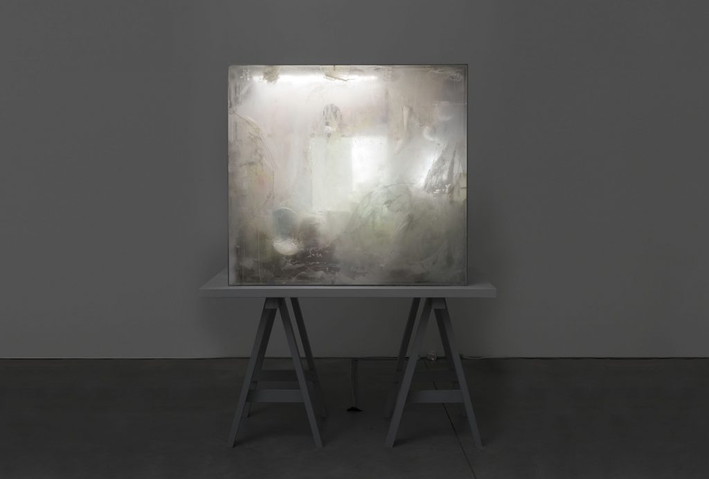
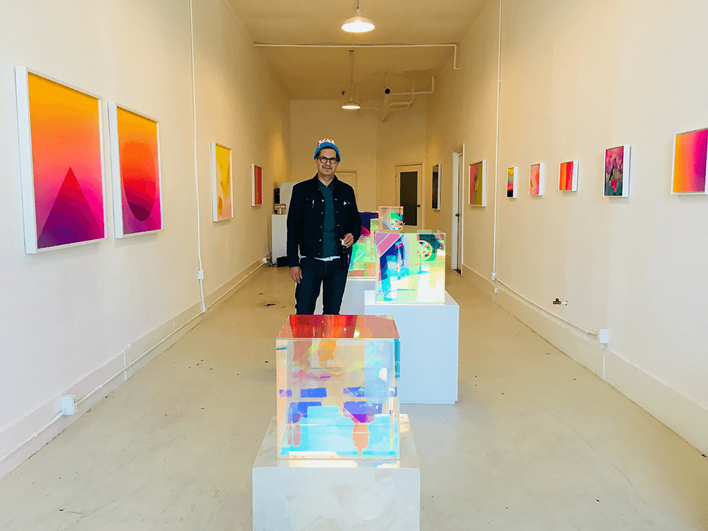
Today, there is a group of artists questioning the creative use of light and our perceptions of brightness in space using all the tools offered by the modern technological age. Bright Matter, an exhibition of these artists, curated by artist ringleader Joanie LeMercier, is currently on view at Muriel Guépin Gallery in New York City (Nov 21st-Dec 11th) and at Miami Project 2014 – Art Basel Miami (Dec 4th-7th). LeMercier, who has created expansive and immersive experiences with light in the past (a digitized forest, 360-degree dome, and 3D geometries for instance), focused his efforts on a smaller scale with the exhibition Bright Matter including his contemporaries LAb[au], Numen / For Use, NONOTAK, and François Wunschel.
You use light as a medium and space as a canvas with a focus on the immediate and personal experience of the viewer. This is a modern minimalist perspective in some ways. Do you relate to this history or find inspiration here? What are the comforts or challenges of labeling your work with such a movement when it is so different with new technology?
I’m fascinated by works from the 60’s and 70’s, when some artists focused on the exploration of visual perception, studying properties of light and stripped down aesthetics. I’m equally struck by pieces from American minimalists, Judd, Flavin and Lewitt, Op Art works from Vasarely, le Parc and Morellet or larger pieces from Turrell, Irwin, and artists from the Light in Space movement. It would be pretentious to compare my work to these masters, but every time I have a chance to witness pieces from these artists, I come across a new stream of inspiration, ideas and excitement.. The most poignant experience I had lately was standing in front of the Wall drawings series from Sol Lewitt at Dia Beacon, and entering the “Backside of the Moon” installation from James Turrell on Naoshima Island. Even if most of my work involves emerging technology that didn’t exist a few years ago, I tend to think that the questions around visual perception haven’t changed much over the past 50 years.
How does scale play a part in your process? Your larger installations are immersive and allow for a suspension of disbelief in the visitor welcoming them into an alternative world to see our world anew.
I’ve explored many formats and scales over the past years, from 1cm origami structures to 100m long building facades. Exploring such variety of sizes allowed me to understand better the medium of light, and how scale, as well as the physical properties of the canvas, affects how we perceive it. The process of visual perception is extremely complex, but the main elements that interest me right now are the position of the spectator relative to the work; basically perspective, and the dynamics of perceived brightness. With a sufficient knowledge and control over these variables, you can then affect the audience’s perception, and by extension change how they see reality.
Your work is fascinating because, no matter the scale, it is mesmerizing, playing tricks on the viewers perceptions. At closer view, the work is relatively methodical and organized based on a series of layers. How have your own perceptions of these layers and their synergistic qualities evolved over the years?
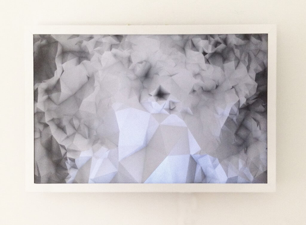
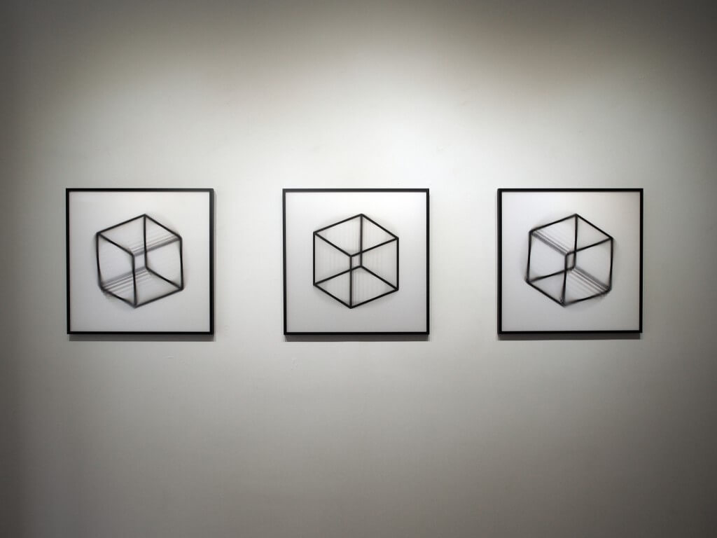
We see the world through light. Our eyes receive a continuous flow of photons, and this flow defines what we assume to be reality. Understanding how this flow of photons behaves is very much the focus of my artistic research. All my works involve two elements: a tangible, physical object and a layer of light. My favorite canvases are either a flat drawing / print, or a three-dimensional sculpture / architecture. I then use light to augment this canvas by adding depth and bringing minimal narratives.
How do you describe your perception during the different stages of creation and that of the viewer of the finished work? Would you describe yourself as a tinkerer or hacker of sorts? Do you relate to those communities and traditions?
A large part of my time is dedicated to research and development. Recent technologies allow us to explore fields that were limited in the past: stereoscopic content, tracking systems, large scale high-quality projection. Creative coding is also a great part of my practice, since all software is made for very specific uses, I often have to develop my own to achieve an idea. I feel very fortunate to have discovered the creative coding and open source communities, which are bringing a lot to both art and technology. I’m trying to give back to the community by releasing tools (like the mapping toolkit and the triangulation tool) that hopefully will be useful to other.
You are a natural collaborator it seems being a founder of the AntiVJ group and currently a curator of the Bright Matter show. Tell me about the conversation you were initiating with AntiVJ. The name seems to imply a reaction or need for more than the established norm.
My practice requires intense traveling to events and festivals, and I’ve been witnessing there the emergence of a new scene of artists, combining the use of light and cutting edge technologies. It’s often while confronting your work with like minded artists, and discovering projects in the making that interesting discussions start, about combining skills to achieve more ambitious ideas. At the time I co founded AntiVJ, the only label or scene that I could relate to was VJ (short for video jockey, the visual equivalent of DJ) and I felt that the potential was wider than club visuals and deserved it’s own label, so we embraced the tools and context while refusing the name. We then copied the concept of a “record label” by creating our own “visual label”: a structure that helped producing the works of artists sharing similar approach, taste and aesthetics. The structure however failed to define itself after 6 years, so I’ve left the label to explore new fields and start new collaborations.
What excites you about curating?
Over the years I discovered some patterns in the works of artists in my field, and I love to share that vision by presenting a selection of pieces in a single space, to put them in perspective and create an environment/context, and also a statement.
It is an age-old question– the idea of design and art being separate entities. How do you reason with the idea of art that is functional as labeled “design” when design that is not commercially productive is labeled “art”?
It’s fairly clear to me how the line can be drawn between design (has a function or offers a solution,) and art, that doesn’t imply such purpose, if any, other than maybe questioning. However, I think these are very permeable nowadays and it wouldn’t be honest to pretend that art doesn’t involve design. Working in galleries and fitting in the “Art World” comes with its set of rules and constraints: works must be sellable, rather simple to install, preferably silent, size must fit on a collectors wall and ideally be framed in a rectangular box. Oh, and the pieces must last in time, forever. Working in a white box, and producing small framed pieces is a (huge) new constraint for me, but I feel it’s slowly turning into a strength, as it helps me to focus on what’s essential.


Responses