Hurray for Hollyweird: A Q&A with Hollywood Mural Project Curator Jill C. Weisberg
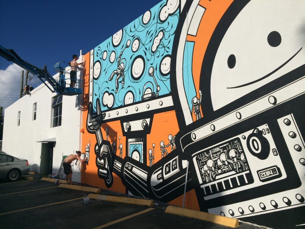
I was raised in Florida. I know what a strange, sometimes wild, and weird place it is. There is a Hollywood in Florida, it’s often called “Hollyweird.” Who better to pin down its visual quirks and idiosyncrasies but designer, curator and artist Jill C. Weisberg. Her official title with the Hollywood Community Redevelopment Agency is “Arts Specialist”, but her long-developed skills in graphic arts and her connection to the local artist community in South Florida is much more nuanced.

The Downtown Hollywood Mural Project
Photo credit: Jill Weisberg
Under her direction, striking public projects from artists such as The London Police, Tatiana Suarez, Kenny Scharf, Nice’n Easy, and the Yuhmi Collective have graced the walls of Hollywood’s odd little Downtown setup. Here, she speaks about her own development from designer to curator, and the evolution of street art in South Florida over the past decade.
We’ve known each other now for almost ten years. I’ve always known you as a creative director and highly involved in the street-art scene in Miami. But I don’t think this a fully-rounded description of what you do. What would you say is the most common misconception about your job?
The most common misconception, when I talk about murals, is that people don’t understand that they’re contemporary art murals. They just think they’re graffiti. They’re like, “Oh! You do graffiti murals!” I say, “No, there’s a big difference between what I curate and what graffiti is.” People are getting a little bit more educated nowadays, with street art or contemporary art murals becoming more prevalent everywhere. People using them to make neighborhoods more interesting, property developers using them to make their properties look more interesting. People get it now. I still get that.
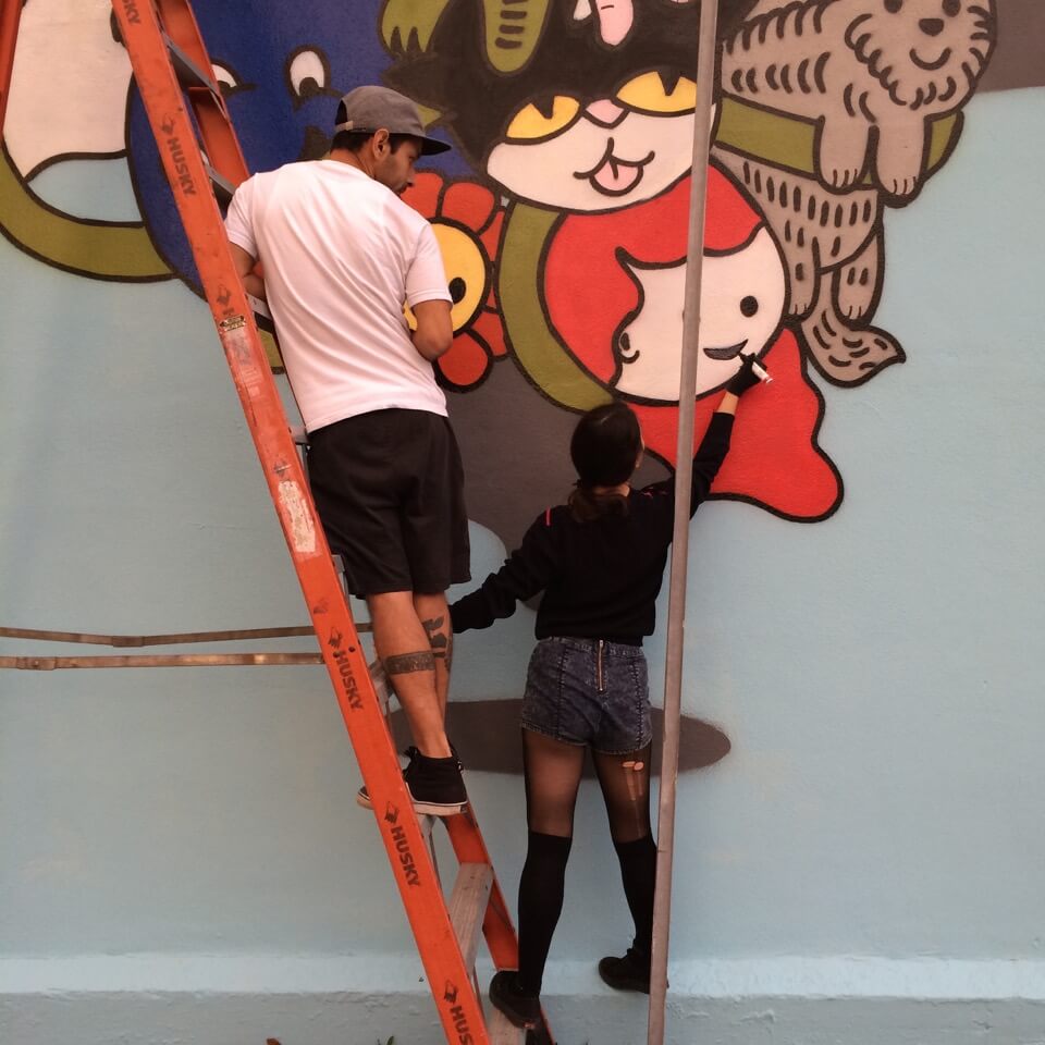
The Downtown Hollywood Mural Project
Photo credit: Jill Weisberg/
Street art has seen a very physical evolution in both Miami and South Florida as becoming an integral part of the urban landscape. This, as I remember, was part of your graduate thesis.
Yes. I have a graduate degree in graphic design. What I talked about in my thesis, basically, was at the time, the particular street art I was dealing with was political or had a message-based bent. The contemporary art murals I’m doing now are more artistic, they don’t necessarily have messaging behind them. This is a family-friendly project, it’s funded by the government, and so on. There’s not a lot of deep meaning behind it. My favorite kind of street art is message-based, but very conceptual. So that’s what I was talking about in my thesis: the difference between conceptual street art and advertising. They’re both trying to get a message through to you [the viewer]. In advertising, they’re trying to get you to buy something, and in conceptual street art it’s trying to get you to think about a [specific] concept; whether its consumerism, whether it’s women’s rights, marginalized people’s rights, the financial community, etc. I found that very interesting, so I started doing my own brand and my own type of street art, and that’s what my thesis was based on.

The Downtown Hollywood Mural Project
Photo credit: Miguel Endara
You would probably class it very succinctly as expository or consumer. And when I say expository, it’s simply a statement self-contained (like a political message). Like any speech could be expository, informative, or consumer-oriented.
Yeah, I would think so. Actually that’s a great word for it, I’m going to have to remember that! That’s kind of what drew me to street art was the fact that they were these pieces of art that were like advertising. Everyone knows who Banksy is. But his concepts are amazing, they’re really well done. He makes you think about things, and you toss those concepts around in your mind after seeing his work. At the same time, he does interesting pieces, visually. That’s the balance that conceptual street art had for me. So what I curate is different than that.
Your company is called Schrift & Fabre. When I met you, I saw your very first business card for it! How did it come about?
Scrift & Farbe is my company, and it started out as a design company. I don’t really do too much design anymore. I do [more] art direction now, mostly for my own projects. Now I do curation and project management for contemporary art murals and any public art, really. It’s evolved. So thinking about how this started out as a graphic design company, Scrift & Farbe is German; “Scrift” for “script” (or “font”) and “Farbe”, which means “ink” or “paint”. So it’s type and ink, or script and paint.
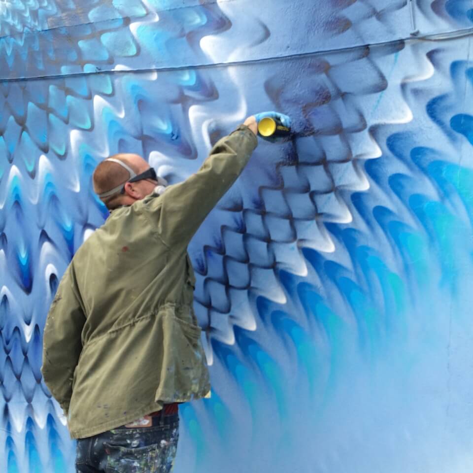
The Downtown Hollywood Mural Project
Photo credit: Jill Weisberg
I think it literally translates to the idea of “ink and paint”, as in cartooning or classic graphic printing.
Exactly. I’m still obsessed with type. The thing is that it’s difficult to make a living with design, because the market is flooded with graphic designers. I have over 20 years of experience with graphic design; since there are so many designers willing to do things for less, it was too difficult for me to do that with so many others undercutting (you). Having said that, there are some people who know me and who look for what I do, specifically.
Talk to me more about Art Basel Miami Beach. You’ve seen its evolution (even longer before I did, since I had only lived in Miami from 2007 to 2013).
I want to say I’d been going since 2004, maybe 2005? Man, it’s crazy.
I was going to ask about your feelings in terms of localized impact: good? Bad? Indifferent?
Indifferent. It’s definitely not for the locals. Everyone tries to do stuff, but I don’t know people who are selling a lot during Basel to people coming for the Basel fairs. It’s mostly, people come in for the fairs, they buy stuff, and then they leave. There’s not too much local commerce going on. There are a lot of local shows and “things”, but they’re not “killing it” like the Basel fairs are. They’re not really for local commerce, but it is an awesome opportunity: the whole world of art is coming to you. If you know people, you don’t even have to pay to get into the fairs. It’s great for me, for that reason. I don’t make an effort to do anything heavy anymore during Basel, ‘cause I worked for too many years during Basel and it’s just not worth it for me.
It seems that a leviathan, private Swiss company holds more dollars whenever the fair lands, and almost none of it gets siphoned to the local community where the artists (and people who sustain the local environment) actually live year-round. Would you say that’s true?
That is accurate. There is money that goes into the local economy via hotels, via restaurants, via taxis and Ubers, and anything that would be a tourist base. You have the Super Bowl, for example, that helps the tourist base. And that’s why Basel was started. That was a time when it was said, “We need to help bring something to Miami to get people to stay in our hotels.” This [December] was a dead period. That’s why it was started at that particular time. But I don’t feel like it does much for the local artists. Especially with regards to street art.
People bring in tons of international street artists. A couple of local artists get stuff here and there; if you really want it, you’ll do a wall somewhere. You’re probably not going to get paid for it. [You’ll probably] get materials. But the international artists get flown in for free, lodging for free, and they don’t really get paid much for walls, either. Most walls that are artist-directed walls, as opposed to commercial projects- I’m not talking about a property developer that’s gonna fly Tristan Eaton in to do something for their building- that’s something else. The local artists aren’t highlighted. Art Basel Miami Beach does official studio tours, I think they’re trying to incorporate the locals a bit more, but afterwards I don’t hear a lot of artists going “We killed it!”
So it’s more residual? Like only a ripple-effect instead of a direct profit?
I don’t even think it’s a ripple effect. Basel doesn’t really have much to do with the local, collector, art scene, at all. I definitely think the gallerists here hustle, and they hustle all year-round, they do have sales during Basel and maybe they make a little bit more. But they’re also selling consistently. The collectors that are coming in are not coming in to look at Miami galleries. They’re coming in to go to the art fairs. Just like when you go to Art Basel Hong Kong, or the Venice Biennale, you’re not looking for “local.” I don’t think it’s really beneficial to the locals. There’s a lot of stuff that goes on year-round that’s more beneficial.
Hollywood, Florida is your home base and where you spearhead the Hollywood Mural Project. What is it about that city that made it such a great cradle for street art projects?
I was born and raised in Hollywood, so I’ve always known the area very well. When I got this opportunity, one of the reasons why I liked it so much was because [Hollywood is] a very unique, eclectic downtown. It’s not “big bucks”, it’s not a pre-fab, it’s not a re-developer site; people call it “Hollyweird.” There’s not a lot of recognizable brands there, it’s all mom-and-pop businesses and individual-owner businesses. Architecturally, it has some blank walls, but it’s not a warehouse district like Wynwood (Miami). That makes it special, too. So, we’ll never really get over-saturated. It has nice alleys that face streets so that you can see them, a lot of big buildings with blank walls, and most of the murals are within a 3 to 5-block radius. It’s very walkable. I thought it was a great opportunity to elevate it: more cultured, richer, more inviting, more surprising. To make it more interesting, because these downtowns are dying as more people buy things on Amazon or go to the mall. But Downtown Hollywood is doing well, and I think it has something to do with the Mural Project.
What is it that you think could take street art projects to the next level? Is it more about core dollars or community engagement?
The plan with Hollywood is to keep doing what we’re doing: old walls? Replace them. More community engagement would be great. The thing that’s happening now, though, is that everybody’s becoming familiar with it. There’s a section in a city (that you would know) where they’re trying to take warehouses and just hiring a guy to paint colorful triangles all over them to make it more “edgy.” It looks horrible. There’s a lot of murals, too, but the quality isn’t there. People are like, “Oh, well Wynwood did it. All we have to do is put paint on walls. People will pay more rent, values will increase, etc.” All of these people who don’t know about art and don’t know about quality curation, or what high quality contemporary art murals look like- they don’t know the difference between that or graffiti or commercial art mural. That’s the problem that’s going on. I don’t need to elevate Downtown Hollywood, it elevates itself. The rendering is beautiful, the actual artwork is beautiful, the location is bright, when you get off I-95 you can (immediately) see it. It’s welcoming you, these artists are welcoming you. These are artist-directed murals, a government-funded, family-friendly project.


Responses